
The marketing world has entered an age in which users are driven to content from mobile native ads and emails in increasing numbers. The challenge to optimize landing pages for this relatively new source of traffic is among the biggest ones currently faced by expert marketers. And, after the recent Google’s algorithm change that demands to have your website optimised for mobile experinece, it becomes inevitable for webmasters and web designers to ignore mobile-optimised landing page if they want to avoid getting penalised from Google. An effort to make landing pages look good and work properly on mobile devices might seem a considerable one, but it pays out remarkably well, as evidenced by examples in this report.
How to make landing pages work on mobile?
Email marketing on mobile devices is an excellent opportunity for segmentation of landing pages. It is no longer enough to rely on a single landing page design that is served to all types of customers across all devices. Instead, it’s recommended to create different landing pages for different sources of traffic, among which are mobile devices (and users). Tracking conversions for each segment makes it easier to distinguish the most successful campaigns and determine the most receptive market segments. Furthermore, creating ad-specific landing pages for each campaign can increase engagement by 115%.

Credit: http://www.conversion-rate-experts.com/seomoz-case-study/
Due to the way in which users interact with mobile devices, first impressions matter in the mobile world more than anywhere else. A landing page that is reached by responding to a CTA in an email should not be too discrepant from the design of the email itself, nor it should be inconsistent with what the marketing copy promises to the customer. The value proposition should be clearly defined and communicated both in the email and on the landing page, preferably by optimizing headlines so that they match relevant search queries or catch the reader’s attention in some other way.
Understanding the importance of first impressions and infusing the headlines with emotional marketing value are giant steps in the right direction. However, it’s essential to remember the technical limitations of mobile devices and not go overboard while trying to create an impressive landing page. Simplicity – with clear messages that spell out the benefits for the customer, eye-catching CTAs surrounded by whitespace, and lead gen forms that don’t ask for too much information – is key when optimizing for mobile.
Credit: http://www.emailmonday.com/mobile-email-usage-statistics
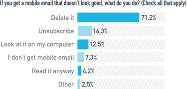
A decluttered landing page improves conversions by 26%, and the reason is not only aesthetic, but also depends on two significant psychological and technical factors. Research shows that users feel more comfortable purchasing via desktop interface, while they use mobile devices to browse and find more information about products. There is also the problem of connection speed which can be slow on mobile networks. A landing page needs to be light and load fast, because up to 43% of users do not revisit slow-loading pages. However, sometimes a complete redesign of landing pages isn’t technically feasible or financially acceptable. In such situations, the focus should be on the elements that are most likely to amplify conversions.
Key concepts:
- Segmentation
- Consistency
- Simplicity
Which landing page elements are worth optimizing?
Not all landing pages are the same (nor should they be), especially if segmentation has been executed successfully. Before optimizing, marketers need to understand customer behavior and test how users interact with different versions of a landing page to decide which elements are most sensible to modify. Eye-tracking tools and heat maps are helpful in this stage of analysis, as they can show which areas attract more user activity. Likewise, the results provided by such tools can help determine the placement of implicit visual cues to steer the attention towards the most important elements of the marketing copy, or to the CTA itself.
Controlling the customer’s focus is easier when the landing page is already simple, and the principle of isolation supports this claim. A landing page without navigation and any other information irrelevant to the campaign is isolated from the rest of the website, and as such it is focused only on a single task of completing the conversion. A (potential) customer is less likely to wander off from a landing page if there are no superfluous links to click.
Still, some elements should be prioritized and retained in order to increase authenticity. The information about the brand, a way to contact the business, and terms & conditions (if any) should be visible and easily accessible from the landing page. Elements like trust badges have been shown to increase sales up to 32%, while adding testimonials to a landing page improves its performance tremendously. Customers clearly recognize the value of transparency, peer reviews and industry awards.
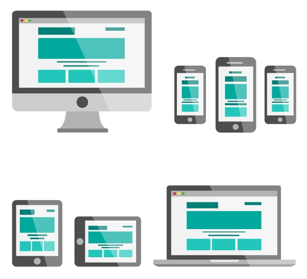
Last but not least, marketers should always work on improving their CTA, whether by applying color psychology to change its look or by using visual cues and smart positioning to emphasize its importance over other landing page elements. A stronger call to action can boost conversions by 32%. When it comes to mobile devices, it’s important to consider the notion of “above the fold” which plays out somewhat differently on screens smaller than the desktop. Optimizing landing pages for mobile often means that the CTA should be placed as close to the top as possible, and the page itself should scale properly with the help of responsive design.
Credit: http://www.freepik.com/free-vector/flat-vector-electronics-set_717966.htm
Optimize:
- Navigation and links
- CTA size, position and color
- Trust factor
Does mobile equal responsive?
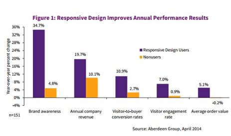
The question is whether landing pages should switch to responsive design – consistent across all devices – or should marketers continue to build mobile-specific pages. The latter used to be a reliable practice that made it possible to customize content for mobile platforms, but the trends are strongly in favor of responsive design:
- the responsive version outperformed the mobile one by 256% owing to simplified navigation;
- A redesign from mobile to responsive brought a 200% increase in overall mobile traffic.
Credit:https://www.linkedin.com/pulse/20140512131703-9223303-responsive-design-websites-have-higher-conversion-rates
Resistance towards responsive design is mainly justified by the perceived costs and complexity of a switch to a design paradigm that is different from the traditional. With templates and tools that make it possible to build landing pages without any coding knowledge, such worries are increasingly becoming outdated, especially considering that testing mobile landing pages can also be automated to a great degree.
At this point, the answer seems self-evident or at least easily predictable for the foreseeable future: responsive is the way to go, even for landing pages. The abovementioned advice still applies, though: responsive landing pages for mobile should load quickly and without popups, be simple with clear copy and visible CTAs, contain short forms, trust badges and be focused on a single action. Choosing responsive design is just one of the options; constantly improving landing pages is a necessity.
