
Think about the last time you did any serious internet surfing on a computer…besides when you weren’t slacking off at work.
If you’re like most people, a majority of your recreational web activities happen on a mobile device. In fact, a recent report has confirmed that we’ve finally reached the point where mobile web traffic has surpassed computer traffic. But that’s not all; in 2015, mobile search will also leapfrog desktop.
And it’s not just mindless surfing either – while internet users used to be pretty particular about only clicking “purchase” on a computer, there’s been a huge spike in the number of shoppers who are browsing and buying from a smartphone or tablet. By the end of 2014, the population of internet users had crossed 3 billion worldwide, while number of active smartphone users touched 1.63 billion.
This shift in internet usage has major implications for business owners who depend on websites and e-commerce for their livelihood and there are several things they can do to boost their mobile sales.
Keep it Stupidly Simple
When it comes to the mobile version of your online shop, the simpler the better. You have to remember that many people are viewing the site on a screen that’s not much bigger than your palm, and the fussier it is, the more likely they’ll bounce off your site.
As you likely know from your own mobile internet browsing experience, we have a very low threshold for frustration when we’re surfing the web on a small screen – if pages are taking a few seconds longer to load than we like or if finding what we want is confusing, we’re out of there faster than you can say, “Goodbye profits.”
E-commerce giants like Amazon and Zappos need apps, but if you’re a small, specialized shop, you really don’t need one, as the latest studies are showing that users prefer a good mobile site to the hassle of having to download an additional app they won’t use very often. Therefore, your goal should be to create a mobile browser experience that has the feel of a clean, easy-to-navigate app.
Seamless Checkout
Shopping cart abandonment is the bane of every e-retailer’s existence. A new customer loads up their cart with goodies only to leave before their actions really have any impact on your bottom line, and it leaves you in a sea of self-doubt. What did you do wrong?
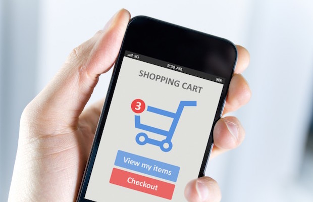
Well, while it may have been fairly easy for an online shopper to add an item to their cart on your mobile site, your checkout process might be the trouble spot. The hassle of setting up an account and inputting payment info on a small screen can be enough to send people running. Your job is to make this key part of the process seamless and quick.
Though you will give them a cut, Paypal offers a good solution. As most people who are savvy enough to be shopping online via a mobile device already have an account, this option removes several steps in the purchasing process. If you don’t want to go that route, you should at least design the checkout page to be responsive and intuitive and capable of saving account info for future purchases.
Testing 123456…
Once you have gotten a killer mobile site designed and implemented, you may think the work is over. But one of the critical steps has really just begun: testing. Just because the new site looks amazing and works like a charm on your iPad doesn’t mean the same will be true on an Android or a Kindle Fire.
There are both free and paid services that will do user experience testing for you on a variety of devices, but you may just want to start with your inner circle. Why not post a request on your Facebook page asking friends and family to poke around the site and make a test purchase from various models of phones and tablets? Just be sure to make it clear that you’re not looking for loving praise, but rather honest, no-holds-barred critiques.
Specific Search
When shoppers comes to your site, it’s likely that they already know what they want. Sure, online window shopping happens, but not nearly as often as hunting for a specific item or type of item. So, you need to make it as easy as possible for people to find what they’re looking for.
This means that in addition to having a general keyword search option, you should also include a fairly sophisticated filter system. Let people arrange the items by price, category and any other variation that is appropriate for your products. If users can’t find what the item they want within a minute of landing on your site, you’ve got a problem and need go back to the drawing board.
Limit Distractions
What is the #1 thing you want users to do when they’re on your mobile e-commerce site? Purchase of course! Keep that in mind as you design and refine the site, and minimize anything that mobile users see that may distract them from the end goal. This is especially critical on the homepage and each product page. Yes, it’s nice for visitors to be able to access your blog or your company’s story, but those are way down on the list of priorities. Consider the tile design trend, which is perfect for mobile homepages.
In addition to considering the size of the screen, it’s helpful to remember that mobile users are also likely to be contending with outside distractions from wherever they are. Make it ridiculously easy to purchase by making the product images and “add to cart” button big and clear. Approach each page of the mobile site with the eye of a ruthless editor and get rid of anything that’s not absolutely necessary.
The fact is that, despite the ever-increasing popularity of mobile internet usage, many faithful online shoppers are still a bit wary about making purchases from their phone or tablet. And rightfully so, because many e-retailers haven’t done much to make the mobile shopping experience feel enjoyable or secure.
Become a mobile shopper yourself and you can begin to understand the issues that get in the way. Then use these tips and your own experience to make your online shop as beautiful and seamless on a smartphone as it is on a laptop.
For more advices/consultancy services on online marketing, please visit WebRev Marketing & Design.

When Web Vs Mobile App Web is better for appearence & checkout. Some apps are just reloading and it seems to be struggle top buy some things, Its losing of time & data applications may use fast access with low data usage.
Anonymous
<!–td {border: 1px solid #ccc;}br {mso-data-placement:same-cell;}–Casperon.com
Casperon.com