
Microsoft has revealed a redesigned logo for Windows 8 on the company’s official Windows Team Blog. There’s a prevarication among users that whether the company’s decision to change Windows’ logo is ethical or not? A simple and light blue Tile based logo of Windows 8 is just a throwback to the classical design of the company’s earliest Windows 1.0 logo, which was designed in 1985. Principal Director of User Experience for Windows, Sam Moreau said that it was better to revise the existing windows OS rather than re-imagine the new Windows logo.
For re-imagined new logo, Microsoft hired a renowned design team “Pentagram”. I appreciate Pentagram’s Paula Scher for asking an incredible question to Microsoft: Your name is Windows, why are you Flag? Indeed, Windows should look alike “windows” (throwback windows 1.0), but, unlike flag—Windows 7, with numbers of colors.

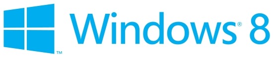
Sam Moreau said, “With the new logo we wanted to celebrate the idea of a window, in perspective. Microsoft and Windows are all about putting technology in people’s hands to empower them to find their own perspectives. And that is what the new logo was meant to be. We did less of a re-design and more to return it to its original meaning and bringing Windows back to its roots – reimagining the Windows logo as just that – a window.”
Windows Team Blog further states that the goal of the company is quite obvious: the logo should be humble, confident, and also, welcome to users with slight tilt perspective. Definitely, the new windows logo might be eye-catching for some folks, but, on the contrary, it might be eye-prong for others. For the windows perspective, the logo quite suites to the company—having tilted blue panel. But, some of the users definitely, will miss the colorful flagged logo as in previous Windows 7, vista and more. The pictures (below) compare Windows new logo with Apple and Hp’s Logo:
![]()
After micro observation, Windows 8 logo seems quite analogous to the flag of Finland. why did the company select such logo which resembled to Finland Flag?
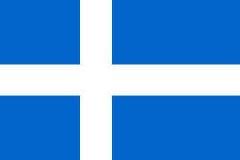
First: Finland has an excellent education system—poke at Bill gates charitable work for the education reform. Definitely, the company wants to move out into the education market. Second: the company wants to woo the Finland-based Nokia—which play vital role for the windows phones role proliferation. This is just hypothetical logic; there could be lots of interesting factors which has enforced the company to design such logo for its new OS.
Before going to further discussion, let you to understand, why logo is really a missed rebranding opportunity?It’s well known that, the windows flag logo has been a part of Microsoft since the 90’s. Commercial keyboards have often a dedicated flag, besides this, laptops installed with windows and all windows phones to the date, have the flag somewhere. But, the new incarnation of windows logo have different logo, somehow would dwindle the Windows brand equity. The latest windows logo has been somewhat unfettered away from the metro design language what it tries to achieve. In fact, the logo is full of gloss, colors, and shadows.
I think this is not the right time for Microsoft to start all these things together—integrating products, services, design, and philosophies. The company’s Windows units’ performance was highly dismal in Q4 (calendar) last year.
 Here, some of the selected icons of Windows and windows Phone have been provided. Definitely, they all are being separated by the colors. These all icon comes under the same Microsoft’s Umbrella, and these will also be same in the case of Windows 8. A doldrums among folks could easily be seen to the new logo of Windows 8. If Microsoft has planned to lure folks by its new looks of windows 8 logo or by gloss of apps icons, then, it’s big mistake of the company. The company has its own philosophy, but, how much it is fruitful that could only be identified after Windows 8 launch later this year.
